Brand kit
Logo, mascot, colors and type.
Everything you need to show Stackfunder on a page, a slide or a partner site. Use the files as they are. The rules below keep them looking right.
Download the full kit (ZIP)Logo and mark
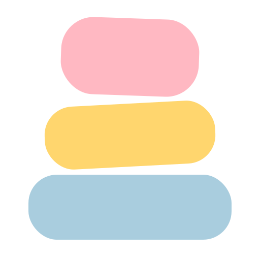
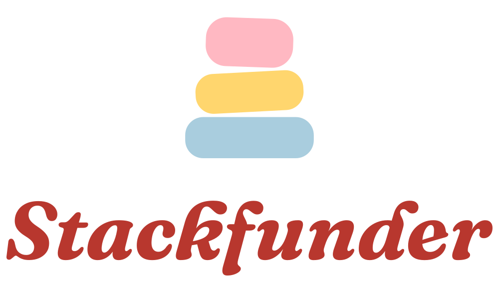
The mark is three tool tiles, stacked. It is the mascot with the face off. Pink on top, butter in the middle, powder at the base.


Clear space and size
- Leave space around the logo equal to the height of the top tile.
- Smallest mark: 16 px on screen, 6 mm in print.
- Smallest horizontal logo: 120 px wide.
- Use the horizontal logo by default. Use the stacked one in square spaces.
Don't
- Change the tile colors or their order.
- Stretch, outline, shadow or rotate the logo.
- Retype the wordmark. Use the files.
- Put the color mark on pink, butter or powder. A tile disappears. Use the one-color mark there.
Icons
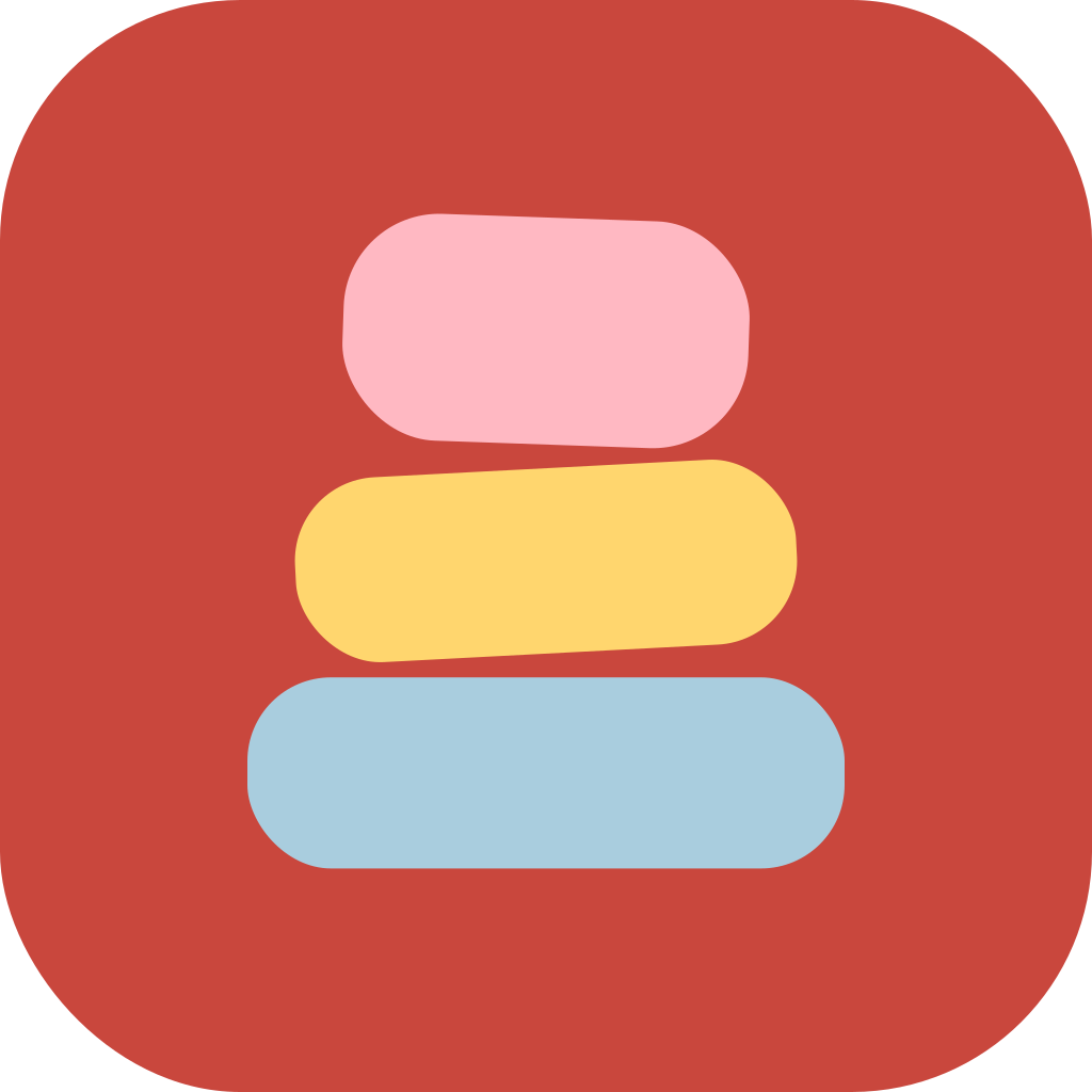
The app icon puts the mark on brick red. The site already uses these for the browser tab, home screen and install prompt.













The Stack
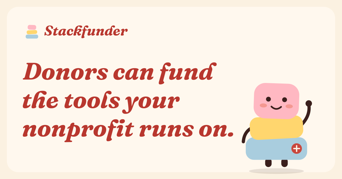
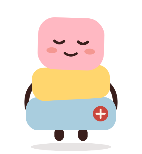
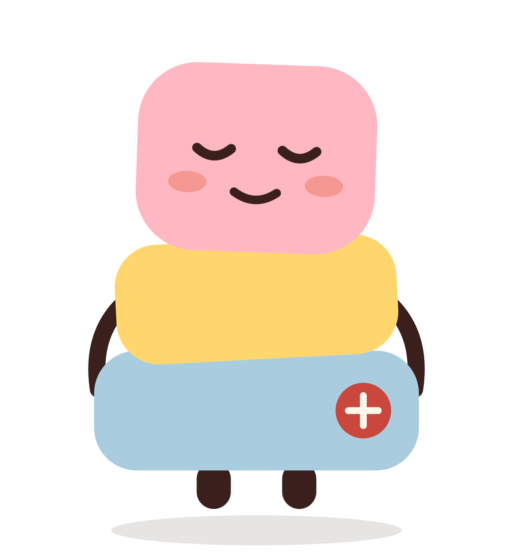
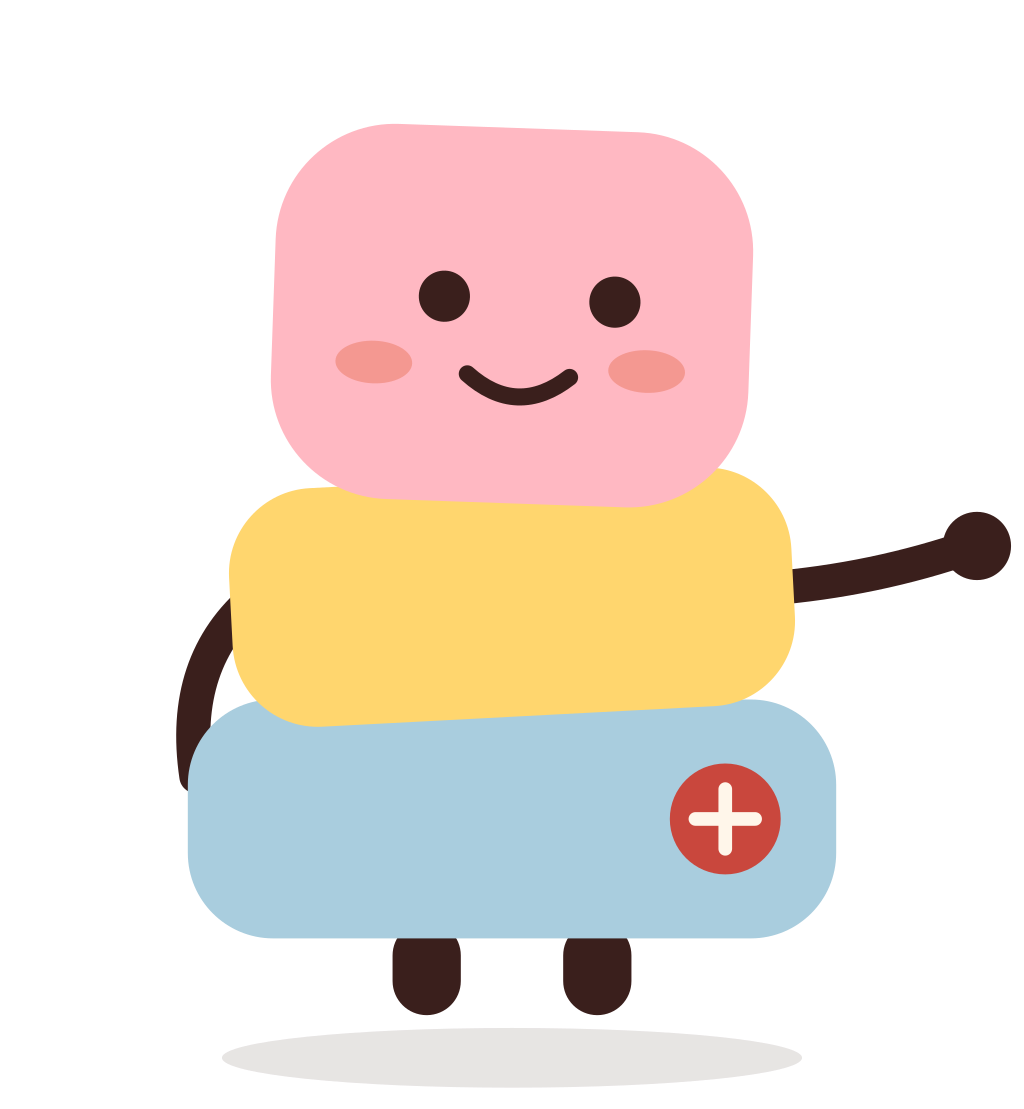
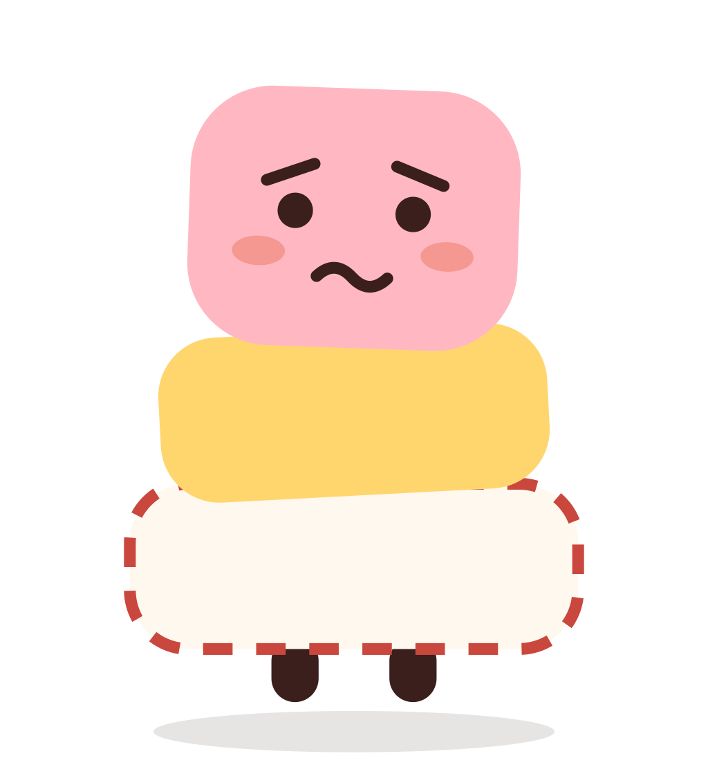
Our mascot is the mark come to life. Each tile is a tool in a nonprofit's stack. It is calm and on your side. It worries about gaps and cheers when a stack is covered.





In motion
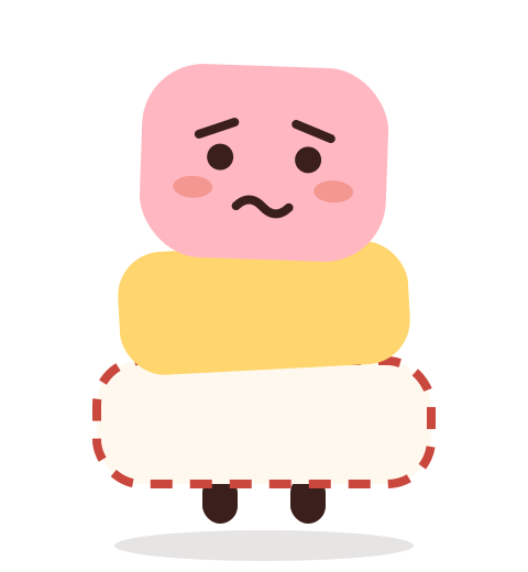
Each tile is a tool in the nonprofit's stack. A tile with no funding shows as a dashed gap. The Stack nods when a tile fills, flinches when one empties, and hops when the whole stack is covered.
1 of 3 tools funded. Two gaps.
Motion is off when your device asks for reduced motion.
Using The Stack
- One per screen, post or email.
- Put it beside the words. Never in place of them, never in place of the logo.
- Use the five poses as drawn. No new faces, props or speech bubbles.
- Keep its colors. Don't recolor, stretch or flip it.
- Light grounds only. In dark mode it sits on a cream tile.
- Worried is for gaps a person can fix. Not for errors, failed payments or bad news about money.
- On the site it may bob gently. It stays still for people who prefer reduced motion.
- Its name is The Stack. It doesn't talk.
Color
Seventies soft. A cream ground, red for words that matter, and five tile colors. Click a chip to copy its hex.
Dark mode
Text on tiles uses Ink. Body text on cream uses Ink, secondary text uses Muted. Both pass contrast. Don't set small text in pink, butter or powder.
Type
Two Google fonts, both free under the SIL Open Font License.
Fraunces
Headings and the wordmark. Bold Italic (700), with the SOFT axis at 100 on the web. Extra Bold (800) for big numbers.
140 families fed on time.
DM Sans
Body, UI and buttons. Regular (400), Medium (500) for buttons and labels, Bold (700) for card titles.
List your stack. Supporters cover the monthly cost.
<link rel="preconnect" href="https://fonts.googleapis.com">
<link rel="preconnect" href="https://fonts.gstatic.com" crossorigin>
<link href="https://fonts.googleapis.com/css2?family=DM+Sans:wght@400;500;700&family=Fraunces:ital,opsz,wght,SOFT@1,9..144,700..800,100&display=swap" rel="stylesheet">
Who we are
Who it's for
Nonprofits first. Then the donors who back them and the software vendors they run on.
How we sound
Warm. Plain. Specific. Steady. We talk about what the tools make possible, not the tools.
How we write
- Short declarative sentences.
- No em dashes. No marketing language.
- Real outcomes, like “140 shifts filled.”
- Would you say it out loud at a bar?